CCB Festival
CCB Festival
CCB Festival
CCB Festival
Client
Client
Client
Client
CCB Festival
CCB Festival
CCB Festival
CCB Festival
Year
Year
Year
Year
2024
2024
2024
2024
Creating a bold and expressive visual identity for a contemporary arts festival that transforms the streets into stages of movement and performance.
Creating a bold and expressive visual identity for a contemporary arts festival that transforms the streets into stages of movement and performance.
Creating a bold and expressive visual identity for a contemporary arts festival that transforms the streets into stages of movement and performance.
Overview
Overview
Overview
Overview
CCB Festival is a one-day event that brings together contemporary expressions of movement arts — from dance and micro-theatre to performance and improvisation — in the streets of Bejís. As the lead designer, I was responsible for building the entire brand identity from the ground up, ensuring the visual language reflected the spirit of the festival: experimental, energetic, and human-centered. The work included the development of the festival's logo, typography, color palette, and graphic elements, along with the creation of the event's official poster and printed program.
CCB Festival is a one-day event that brings together contemporary expressions of movement arts — from dance and micro-theatre to performance and improvisation — in the streets of Bejís. As the lead designer, I was responsible for building the entire brand identity from the ground up, ensuring the visual language reflected the spirit of the festival: experimental, energetic, and human-centered. The work included the development of the festival's logo, typography, color palette, and graphic elements, along with the creation of the event's official poster and printed program.
CCB Festival is a one-day event that brings together contemporary expressions of movement arts — from dance and micro-theatre to performance and improvisation — in the streets of Bejís. As the lead designer, I was responsible for building the entire brand identity from the ground up, ensuring the visual language reflected the spirit of the festival: experimental, energetic, and human-centered. The work included the development of the festival's logo, typography, color palette, and graphic elements, along with the creation of the event's official poster and printed program.
CCB Festival is a one-day event that brings together contemporary expressions of movement arts — from dance and micro-theatre to performance and improvisation — in the streets of Bejís. As the lead designer, I was responsible for building the entire brand identity from the ground up, ensuring the visual language reflected the spirit of the festival: experimental, energetic, and human-centered. The work included the development of the festival's logo, typography, color palette, and graphic elements, along with the creation of the event's official poster and printed program.
Client
Client
Client
Client
CCB Festival
CCB Festival
CCB Festival
CCB Festival
Industry
Industry
Industry
Industry
Entretainment
Entretainment
Entretainment
Entretainment
Service
Service
Service
Service
Branding
Branding
Branding
Branding
Digital design
Digital design
Digital design
Digital design
Printed Design
Printed Design
Printed Design
Printed Design
Duration
Duration
Duration
Duration
4 Weeks
4 Weeks
4 Weeks
4 Weeks


The Challenge
The Challenge
The Challenge
The Challenge
The biggest challenge was to create a visual identity that could capture the experimental and fluid nature of the festival — one that was contemporary and daring, yet accessible to a wide audience. It had to evoke movement and spontaneity, while still remaining cohesive across multiple formats.
The biggest challenge was to create a visual identity that could capture the experimental and fluid nature of the festival — one that was contemporary and daring, yet accessible to a wide audience. It had to evoke movement and spontaneity, while still remaining cohesive across multiple formats.
The biggest challenge was to create a visual identity that could capture the experimental and fluid nature of the festival — one that was contemporary and daring, yet accessible to a wide audience. It had to evoke movement and spontaneity, while still remaining cohesive across multiple formats.
The biggest challenge was to create a visual identity that could capture the experimental and fluid nature of the festival — one that was contemporary and daring, yet accessible to a wide audience. It had to evoke movement and spontaneity, while still remaining cohesive across multiple formats.

The Solution
The Solution
The Solution
The Solution
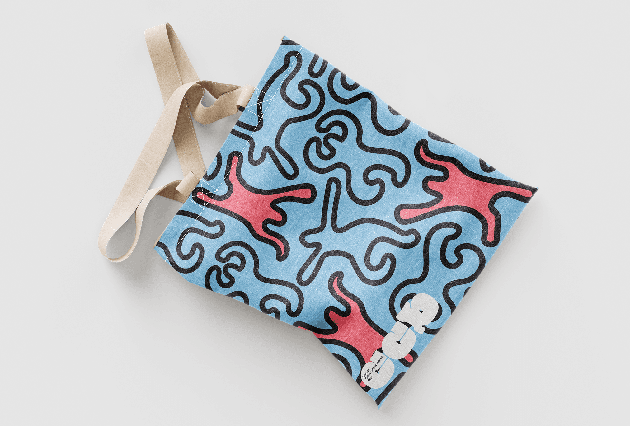
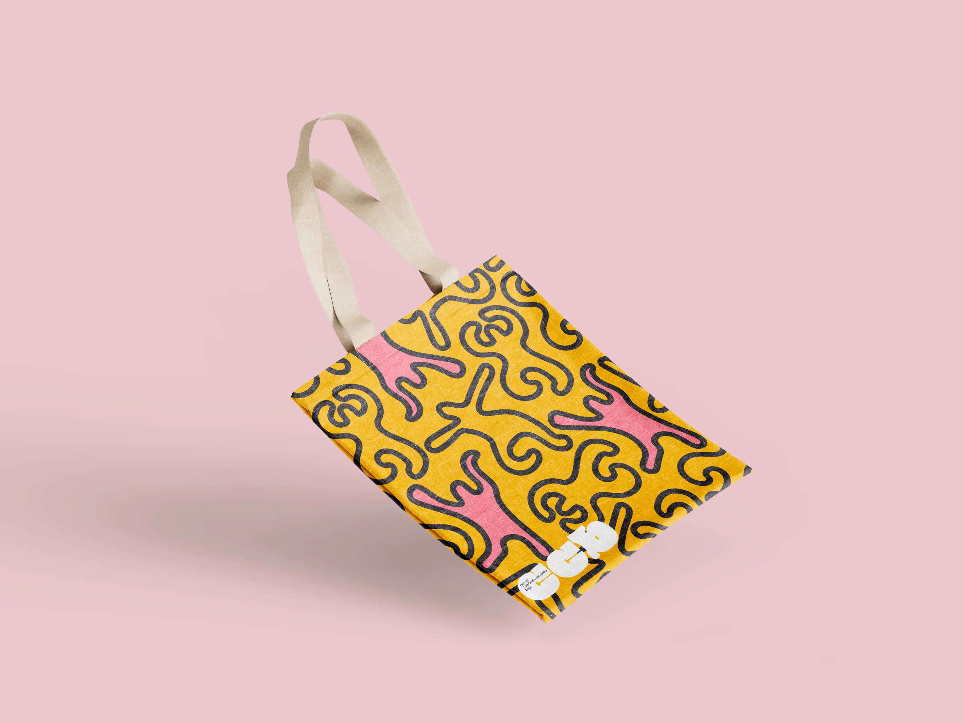
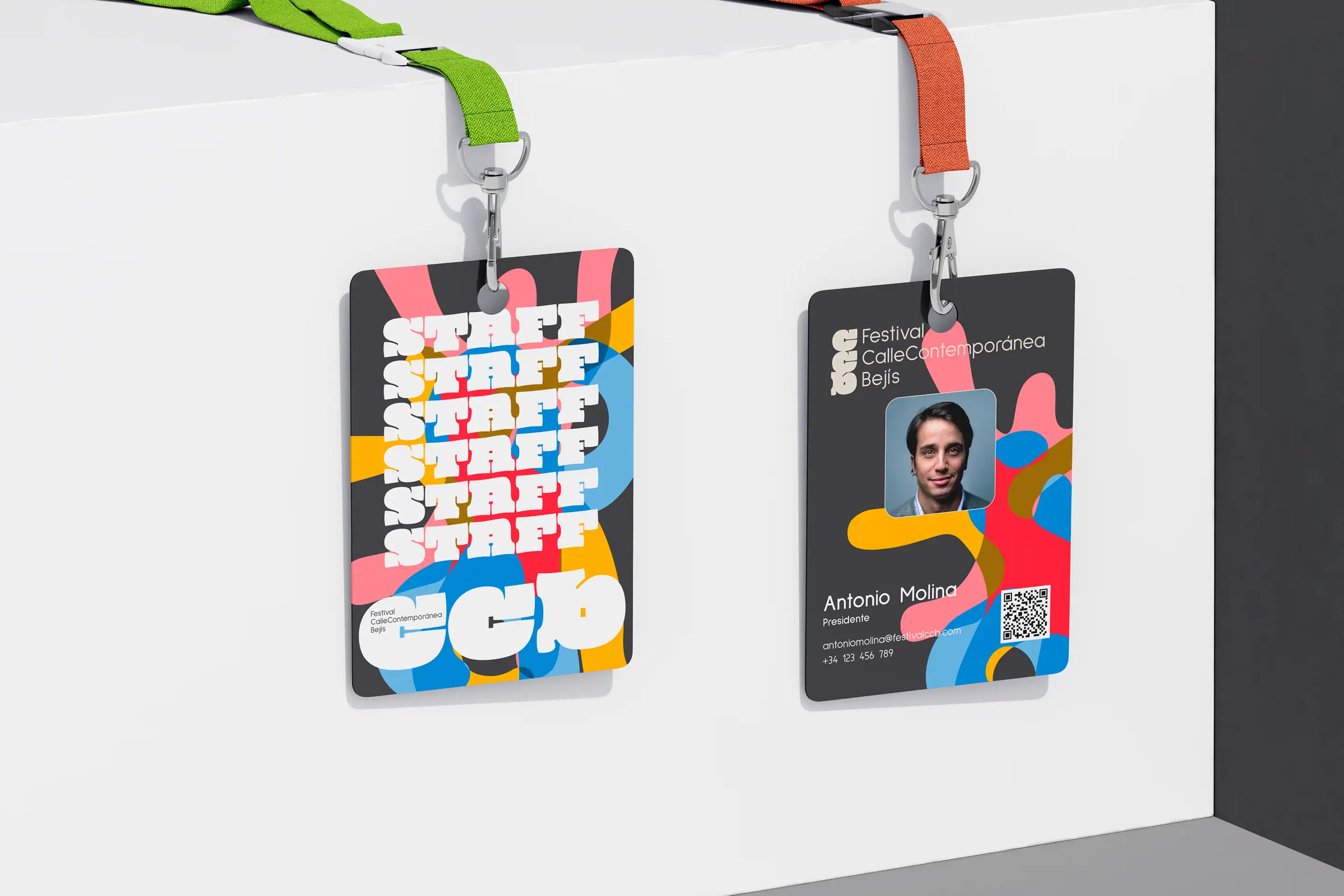
I began by exploring the concepts of body expression and urban spontaneity, translating them into graphic forms. The logo was designed with abstract movement in mind, using dynamic shapes and a raw, slightly deconstructed aesthetic. A bold but earthy color palette gave it energy without overwhelming the content. The typography was carefully chosen to balance legibility with character, supporting the contemporary tone of the event. Graphic elements mimicked movement and improvisation, tying the whole identity together across different materials — from the poster to the event program.
I began by exploring the concepts of body expression and urban spontaneity, translating them into graphic forms. The logo was designed with abstract movement in mind, using dynamic shapes and a raw, slightly deconstructed aesthetic. A bold but earthy color palette gave it energy without overwhelming the content. The typography was carefully chosen to balance legibility with character, supporting the contemporary tone of the event. Graphic elements mimicked movement and improvisation, tying the whole identity together across different materials — from the poster to the event program.
I began by exploring the concepts of body expression and urban spontaneity, translating them into graphic forms. The logo was designed with abstract movement in mind, using dynamic shapes and a raw, slightly deconstructed aesthetic. A bold but earthy color palette gave it energy without overwhelming the content. The typography was carefully chosen to balance legibility with character, supporting the contemporary tone of the event. Graphic elements mimicked movement and improvisation, tying the whole identity together across different materials — from the poster to the event program.
I began by exploring the concepts of body expression and urban spontaneity, translating them into graphic forms. The logo was designed with abstract movement in mind, using dynamic shapes and a raw, slightly deconstructed aesthetic. A bold but earthy color palette gave it energy without overwhelming the content. The typography was carefully chosen to balance legibility with character, supporting the contemporary tone of the event. Graphic elements mimicked movement and improvisation, tying the whole identity together across different materials — from the poster to the event program.
The Result
The Result
The Result
The Result
The branding successfully communicated the experimental and inclusive nature of CCB Festival. The materials generated curiosity and engagement in the local community, and the poster became a recognizable visual in the area. Organizers praised the cohesive and fresh look of the identity, and the visual system set the tone for future editions of the festival.
The branding successfully communicated the experimental and inclusive nature of CCB Festival. The materials generated curiosity and engagement in the local community, and the poster became a recognizable visual in the area. Organizers praised the cohesive and fresh look of the identity, and the visual system set the tone for future editions of the festival.
The branding successfully communicated the experimental and inclusive nature of CCB Festival. The materials generated curiosity and engagement in the local community, and the poster became a recognizable visual in the area. Organizers praised the cohesive and fresh look of the identity, and the visual system set the tone for future editions of the festival.
The branding successfully communicated the experimental and inclusive nature of CCB Festival. The materials generated curiosity and engagement in the local community, and the poster became a recognizable visual in the area. Organizers praised the cohesive and fresh look of the identity, and the visual system set the tone for future editions of the festival.

PORTFOLIO
PORTFOLIO
PORTFOLIO
CHECK OUT SOME MORE
CHECK OUT SOME MORE
CHECK OUT SOME MORE
CHECK OUT SOME MORE
Bibble
Bibble
Bibble
Brand Identity
Digital Design
Printed Design
Bibble
Bibble
Bibble
Brand Identity
Digital Design
Printed Design
Bibble
Bibble
Bibble
Brand Identity
Digital Design
Printed Design
Bibble
Bibble
Bibble
Brand Identity
Digital Design
Printed Design
Form Fit
Form Fit
Form Fit
Brand Identity
Digital Design
Form Fit
Form Fit
Form Fit
Brand Identity
Digital Design
Form Fit
Form Fit
Form Fit
Brand Identity
Digital Design
Form Fit
Form Fit
Form Fit
Brand Identity
Digital Design
HAVE A PROJECT
HAVE A PROJECT
HAVE A PROJECT
HAVE A PROJECT
IN MIND ?
IN MIND ?
IN MIND ?
IN MIND ?