Form Fit
Form Fit
Form Fit
Form Fit
Client
Client
Client
Client
Form Fit
Form Fit
Form Fit
Form Fit
Year
Year
Year
Year
2024
2024
2024
2024
Designing a serene and modern brand identity for a Pilates studio that celebrates strength, balance, and mindful movement.
Designing a serene and modern brand identity for a Pilates studio that celebrates strength, balance, and mindful movement.
Designing a serene and modern brand identity for a Pilates studio that celebrates strength, balance, and mindful movement.
Overview
Overview
Overview
Overview
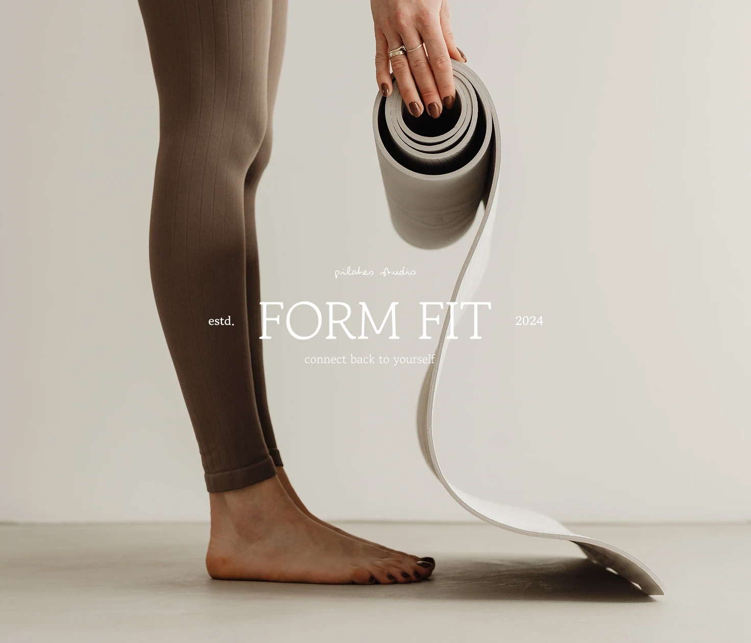
Form Fit is a Pilates studio dedicated to promoting strength, flexibility, and proper body alignment through mindful practice. For this project, I developed a complete branding concept that reflects the studio’s philosophy of fluid, intentional movement. My work included creating a minimalist logo, defining an earthy color palette, designing organic graphic elements, and crafting marketing materials — all tailored to create a calming and welcoming atmosphere for the wellness community.
Form Fit is a Pilates studio dedicated to promoting strength, flexibility, and proper body alignment through mindful practice. For this project, I developed a complete branding concept that reflects the studio’s philosophy of fluid, intentional movement. My work included creating a minimalist logo, defining an earthy color palette, designing organic graphic elements, and crafting marketing materials — all tailored to create a calming and welcoming atmosphere for the wellness community.
Form Fit is a Pilates studio dedicated to promoting strength, flexibility, and proper body alignment through mindful practice. For this project, I developed a complete branding concept that reflects the studio’s philosophy of fluid, intentional movement. My work included creating a minimalist logo, defining an earthy color palette, designing organic graphic elements, and crafting marketing materials — all tailored to create a calming and welcoming atmosphere for the wellness community.
Form Fit is a Pilates studio dedicated to promoting strength, flexibility, and proper body alignment through mindful practice. For this project, I developed a complete branding concept that reflects the studio’s philosophy of fluid, intentional movement. My work included creating a minimalist logo, defining an earthy color palette, designing organic graphic elements, and crafting marketing materials — all tailored to create a calming and welcoming atmosphere for the wellness community.
Client
Client
Client
Client
Form Fit
Form Fit
Form Fit
Form Fit
Industry
Industry
Industry
Industry
Wellness
Wellness
Wellness
Wellness
Service
Service
Service
Service
Brand Identity
Brand Identity
Brand Identity
Brand Identity
Digital Design
Digital Design
Digital Design
Digital Design
Duration
Duration
Duration
Duration
2 Weeks
2 Weeks
2 Weeks
2 Weeks
The Challenge
The Challenge
The Challenge
The Challenge
The key challenge was to design a brand identity that would feel both strong and gentle — capturing the disciplined nature of Pilates while maintaining an inviting, nurturing vibe that appeals to a broad range of wellness seekers.
The key challenge was to design a brand identity that would feel both strong and gentle — capturing the disciplined nature of Pilates while maintaining an inviting, nurturing vibe that appeals to a broad range of wellness seekers.
The key challenge was to design a brand identity that would feel both strong and gentle — capturing the disciplined nature of Pilates while maintaining an inviting, nurturing vibe that appeals to a broad range of wellness seekers.
The key challenge was to design a brand identity that would feel both strong and gentle — capturing the disciplined nature of Pilates while maintaining an inviting, nurturing vibe that appeals to a broad range of wellness seekers.
The Solution
The Solution
The Solution
The Solution
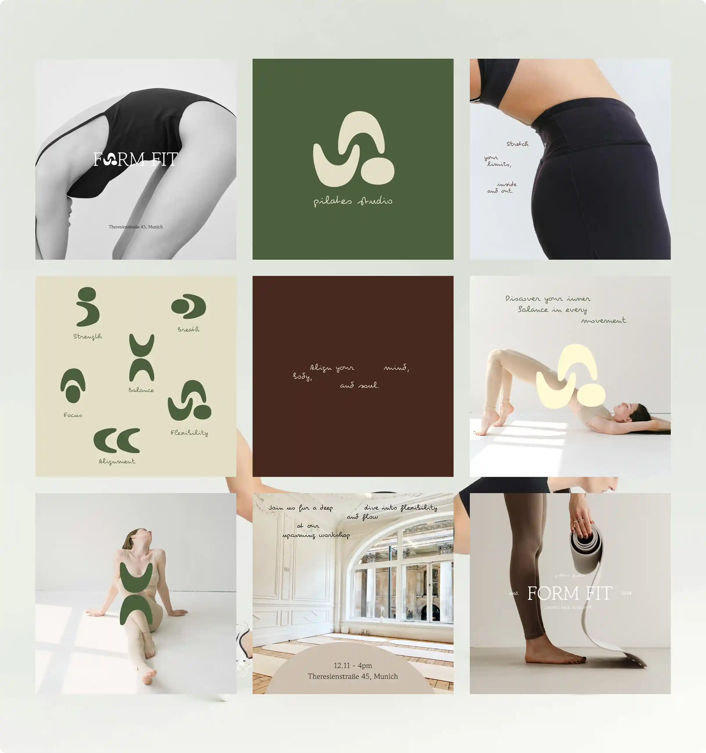
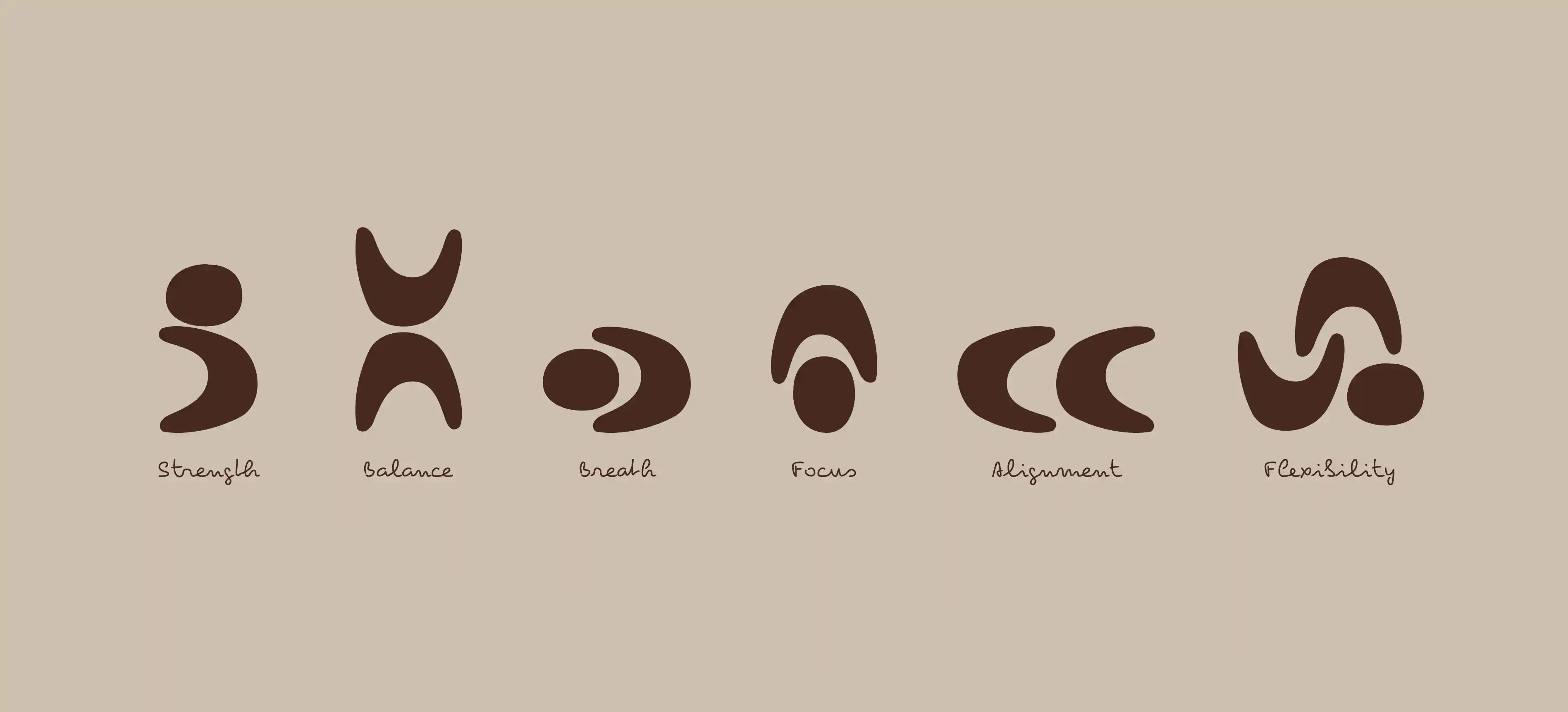
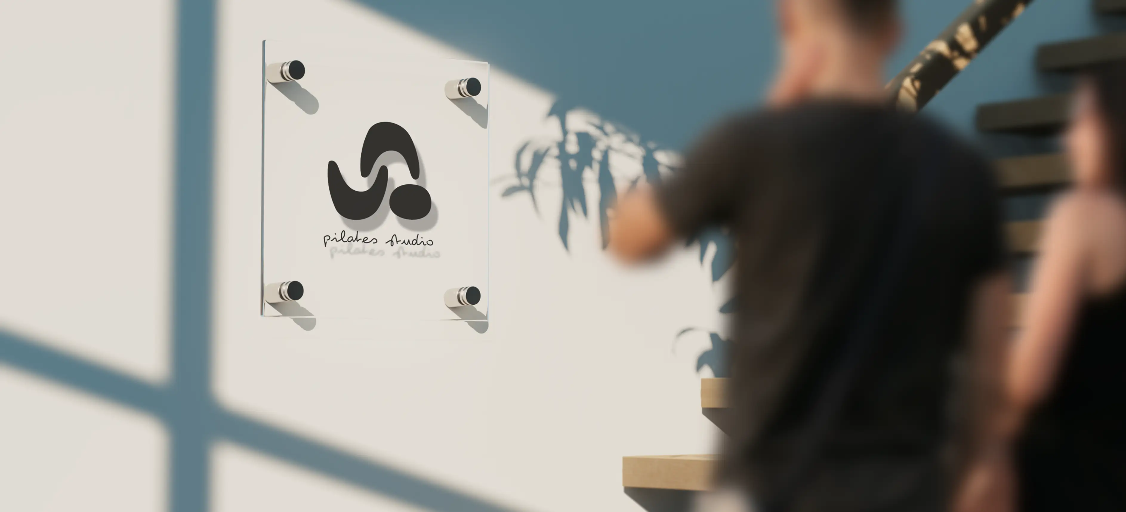
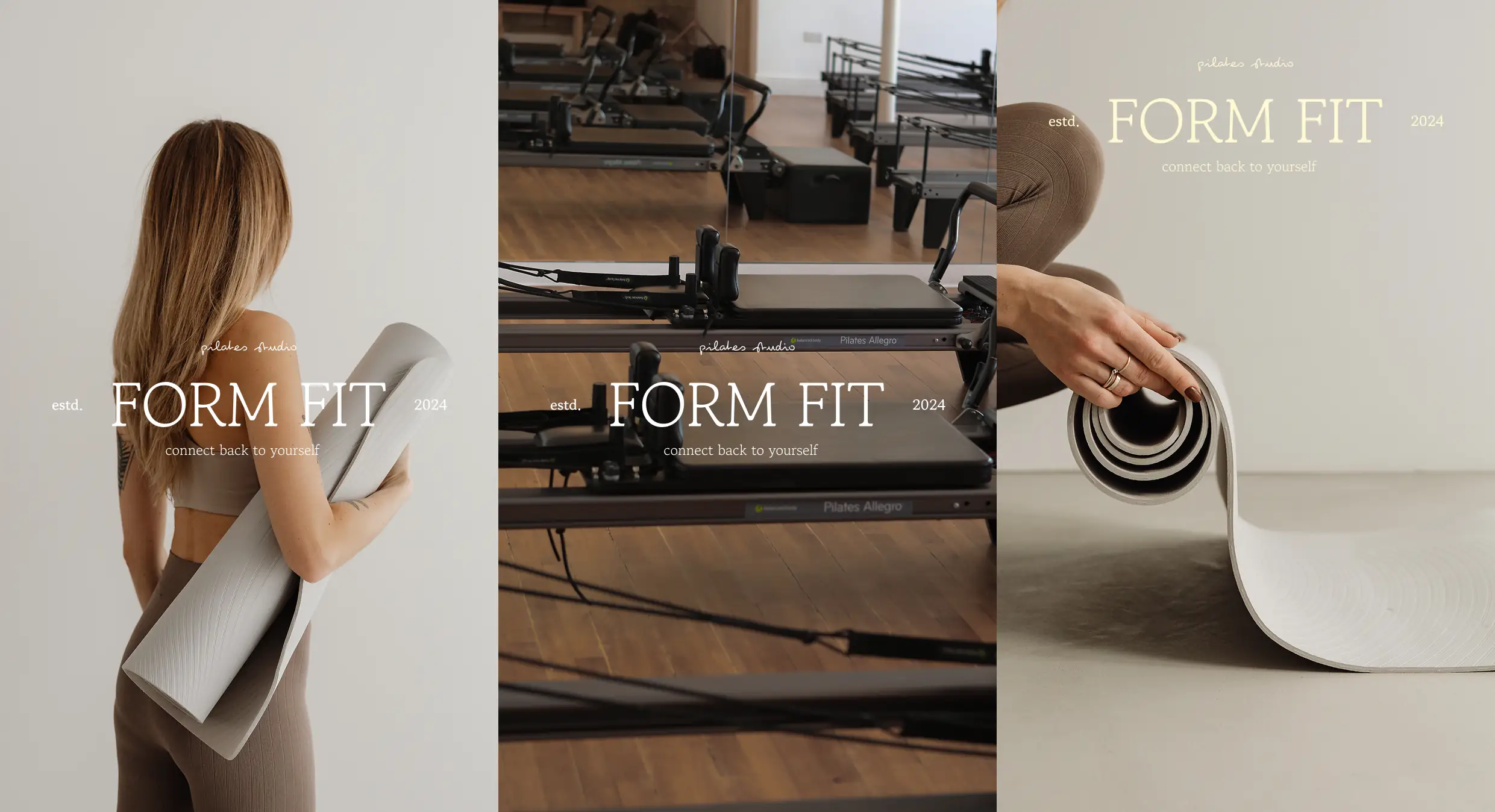
We drew inspiration from the fluidity and precision of Pilates movements, creating a minimalist logo that conveys balance and flow. The earthy color palette, combined with soft, organic shapes, evokes a natural and grounded feeling, ideal for a wellness-focused environment. The typography was selected for its clean lines and elegance, reinforcing the brand's commitment to simplicity and mindfulness across all touchpoints, from signage to digital presence.
We drew inspiration from the fluidity and precision of Pilates movements, creating a minimalist logo that conveys balance and flow. The earthy color palette, combined with soft, organic shapes, evokes a natural and grounded feeling, ideal for a wellness-focused environment. The typography was selected for its clean lines and elegance, reinforcing the brand's commitment to simplicity and mindfulness across all touchpoints, from signage to digital presence.
We drew inspiration from the fluidity and precision of Pilates movements, creating a minimalist logo that conveys balance and flow. The earthy color palette, combined with soft, organic shapes, evokes a natural and grounded feeling, ideal for a wellness-focused environment. The typography was selected for its clean lines and elegance, reinforcing the brand's commitment to simplicity and mindfulness across all touchpoints, from signage to digital presence.
We drew inspiration from the fluidity and precision of Pilates movements, creating a minimalist logo that conveys balance and flow. The earthy color palette, combined with soft, organic shapes, evokes a natural and grounded feeling, ideal for a wellness-focused environment. The typography was selected for its clean lines and elegance, reinforcing the brand's commitment to simplicity and mindfulness across all touchpoints, from signage to digital presence.
The Result
The Result
The Result
The Result
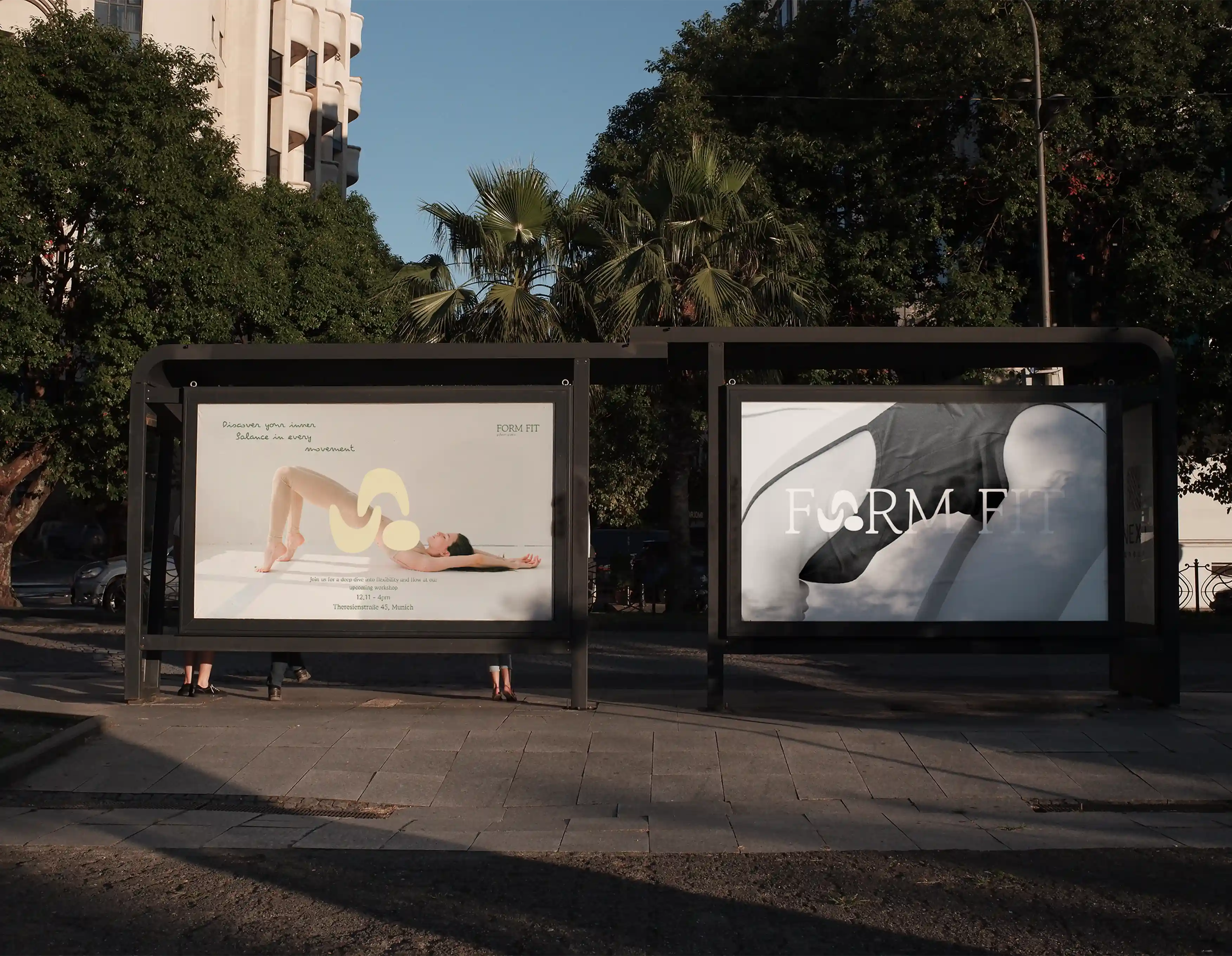
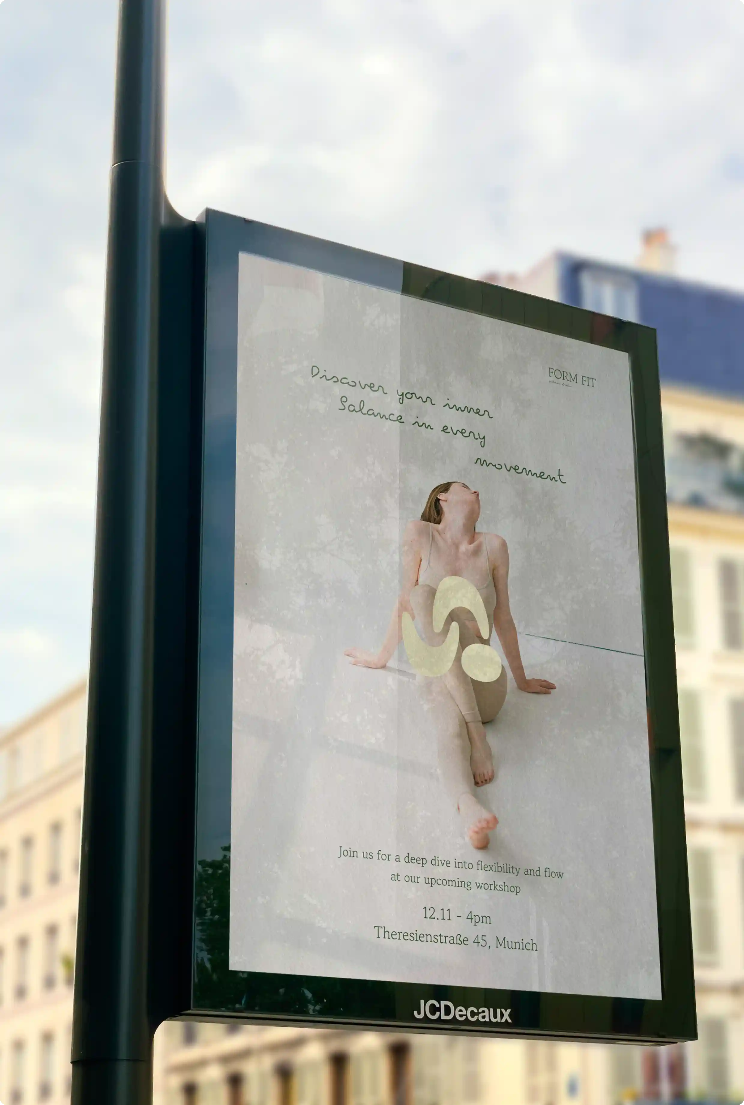
The visual identity successfully captured Form Fit’s core values, offering a modern yet approachable brand presence. The calming aesthetic helped differentiate the studio in a crowded wellness market, making it instantly recognizable and resonant with its target audience. The branding served as a strong foundation for marketing campaigns and future expansion.
The visual identity successfully captured Form Fit’s core values, offering a modern yet approachable brand presence. The calming aesthetic helped differentiate the studio in a crowded wellness market, making it instantly recognizable and resonant with its target audience. The branding served as a strong foundation for marketing campaigns and future expansion.
The visual identity successfully captured Form Fit’s core values, offering a modern yet approachable brand presence. The calming aesthetic helped differentiate the studio in a crowded wellness market, making it instantly recognizable and resonant with its target audience. The branding served as a strong foundation for marketing campaigns and future expansion.
The visual identity successfully captured Form Fit’s core values, offering a modern yet approachable brand presence. The calming aesthetic helped differentiate the studio in a crowded wellness market, making it instantly recognizable and resonant with its target audience. The branding served as a strong foundation for marketing campaigns and future expansion.
PORTFOLIO
PORTFOLIO
PORTFOLIO
CHECK OUT SOME MORE
CHECK OUT SOME MORE
CHECK OUT SOME MORE
CHECK OUT SOME MORE

Bibble
Bibble
Bibble

Brand Identity
Digital Design
Printed Design
Bibble
Bibble
Bibble
Brand Identity
Digital Design
Printed Design
Bibble
Bibble
Bibble
Brand Identity
Digital Design
Printed Design
Bibble
Bibble
Bibble
Brand Identity
Digital Design
Printed Design
CCB Festival
CCB Festival
CCB Festival
Branding
Digital design
Printed Design
CCB Festival
CCB Festival
CCB Festival
Branding
Digital design
Printed Design
CCB Festival
CCB Festival
CCB Festival
Branding
Digital design
Printed Design
CCB Festival
CCB Festival
CCB Festival
Branding
Digital design
Printed Design
HAVE A PROJECT
HAVE A PROJECT
HAVE A PROJECT
HAVE A PROJECT
IN MIND ?
IN MIND ?
IN MIND ?
IN MIND ?